Logo Design & Identity for MonoSystems
Project Details
- Art director: Trevor Williams
- Client: Monosystems Inc.
- Date: September 26, 2013
- Tags: Identity, Print
Logo design for wire management company.

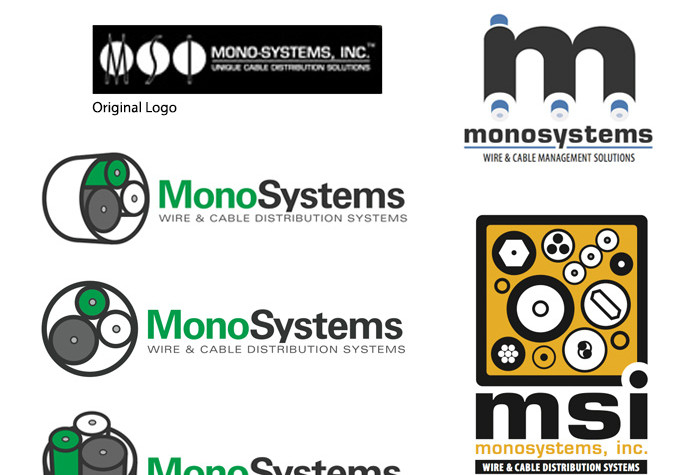
MonoSystems (MSI) Original Logo
Before embarking on a much-needed website re-design, we suggested a refresh for the Monosystems logo. The current and long-standing logo had a bit of an identity crisis – some people knew the company as “MSI” and others as “Mono-Systems” which had caused some amount of confusion over their many years in business. Aside from this, the logo design was dated and did not reflect some of the new technology that MonoSystems was bringing to the market.
Since their URL was “monosystems.com”, the first thing we proposed was dropping the hyphen from the company name to create a unity with their online presence which we were going to build. To further this direction we made the name read as one word – separating them visually by capitalizing the “M” and the “S”. Along with the logo design several tag lines were suggested with “Wire Management. Managed.” emerging as the winner.


Comments are closed.