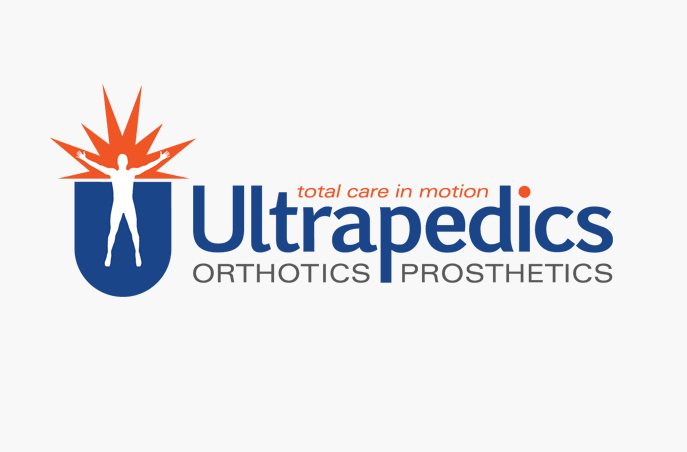
Ultrapedics Logo
Project Details
- Designer: Trevor Williams
- Client: Ultrapedics Ltd
- Date: March 2, 2014
- Tags: Identity
As part of their forthcoming website redesign, Ultrapedics needed to update their logo. Aside from using a plain, dated typeface, the original logo was not visually balanced and did not fit well into most applications, especially online where the small, curved tagline and descriptor (Prosthetics & Orthotics) would be unreadable.
Original Ultrapedics Logo
The orange color of the burst is balanced by both the tagline running between the ascenders of the “t” and “d” and the dot on the “i”. The main typeface (Euphemia) was chosen for it’s authoritative, but friendly appearance. The descriptor (Orthotics/Prosthetics) is now clear and legible and balanced on either side of the “p”.
Related Projects

Wells Pharmacy Trade Show Booth
Identity / Marketing
My Cute Bag Logo
Identity / Print
Geek Propoganda
Identity
SalesCoupe
Identity / Online / Packaging
Logo Design & Labels for Great South Bay Brewery
Identity / Packaging / Print
Logo Design & Identity for MonoSystems
Identity / Print